

Have a look at BeTheme and its 500+ pre-built websites. These clean and classic designs have real staying power.
That’s because they’re centered around strong design principles. Not flashy color palettes, hip font choices, or technology your users aren’t ready for or don’t need. And that’s the key, right?
You’re building websites for the end user — not for yourself.
Spending your time using web design trends that will come and go is making barely any impact on your visitors. You can take advantage of these tried, tested, and long-lasting web design trends …
Trend #1: Remove the Excess and Create a Super Minimal Navigation
One of the awesome advantages of the Web moving towards a more mobile-first experience is that websites viewed on desktop have become simpler and easier to navigate, too.
With more consumers flocking to the Web on their smartphones, website menus have had to shrink in size. Not only in terms of the space they comprise, but also in the number of links.
In 2020 and onwards, websites will have only the most essential of pages in the primary menu. Secondary links will be relegated to areas like the footer and sidebar. Consequently, this will help to clean up on-page designs. They won’t be so littered with call-to-action buttons pointing to internal pages.
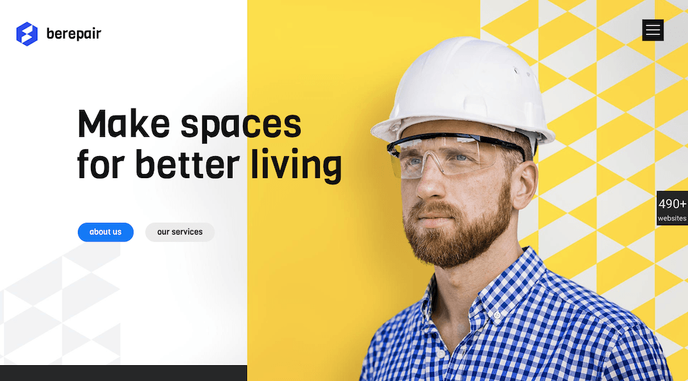
The BeRepair pre-built site is a beautiful example of this. With its navigation tucked away under a hamburger menu icon:
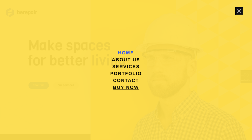
When opened, the pop-out menu follows the trend of less-is-more. It has a short and simple-to-navigate list of links surrounded by a bunch of white space:
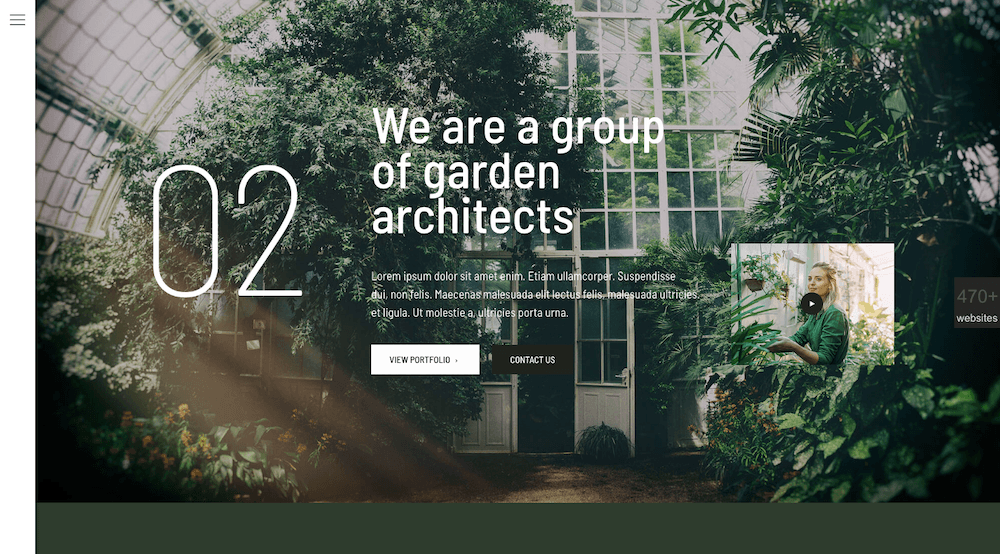
Non-traditional navigations can also benefit from this form of minimalism. BeGardendemonstrates this with its left-aligned menu:
Trend #2: Bring Greater Focus to Your Message with White Space
Users are overloaded with content, offers, and other distractions every time they hit the Internet. Do you really want your website to be one more thing that causes them stress and, in turn, indecisiveness?
When you design with white space, it gets you out of the habit of trying to put as much information and as many options into a single section or page as possible. Instead, it encourages you to do more with less.
Concise messaging + Wide, open spaces = Good for your conversion rate.
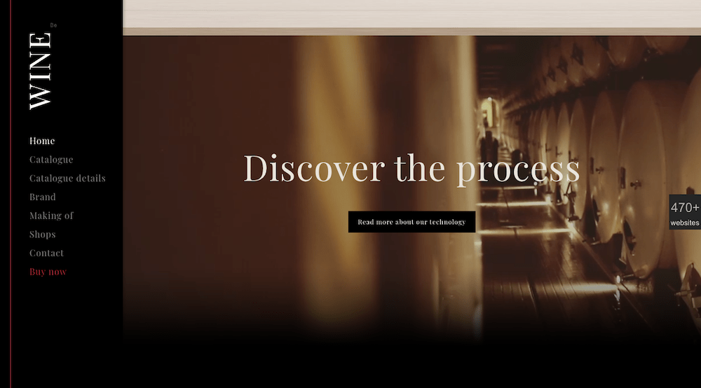
Take, for instance, this brief but powerful video banner at the bottom of BeWine:
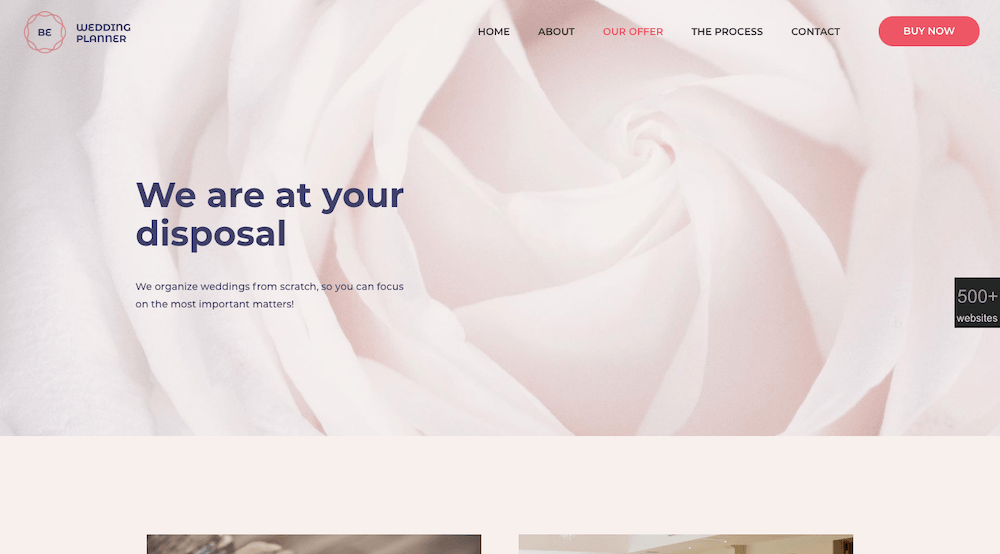
You can find other ways to let strong yet simple imagery tell your brand’s story, as the BeWeddingPlanner site does:
Trend #3: Give Visitors a Human Face to Connect To
It doesn’t matter who your website or brand serves. It can be blog readers, online shoppers, or business customers looking for new software. They’re looking for brands to be loyal to.
Not only does loyalty to one company create less work for them. It gives them the peace of mind knowing they’re getting a high-quality product or result every time.
Sometimes you’re not responsible for shaping the company’s offering. But the way you present the website to the world will affect how visitors initially feel about it.
So, rather than use digitally constructed designs, integrate more human faces and real-world objects into your websites. The best way to start a relationship with prospective customers is to make them feel as though they’re interacting with someone instead of something.
Even for companies in the business of selling things, bringing some life to your imagery can help improve the connections visitors have with your site.
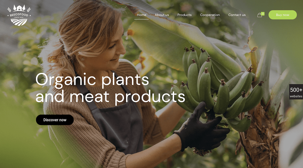
BeEcoFood, for instance, adds warmth to its website with this header that’s full of life:
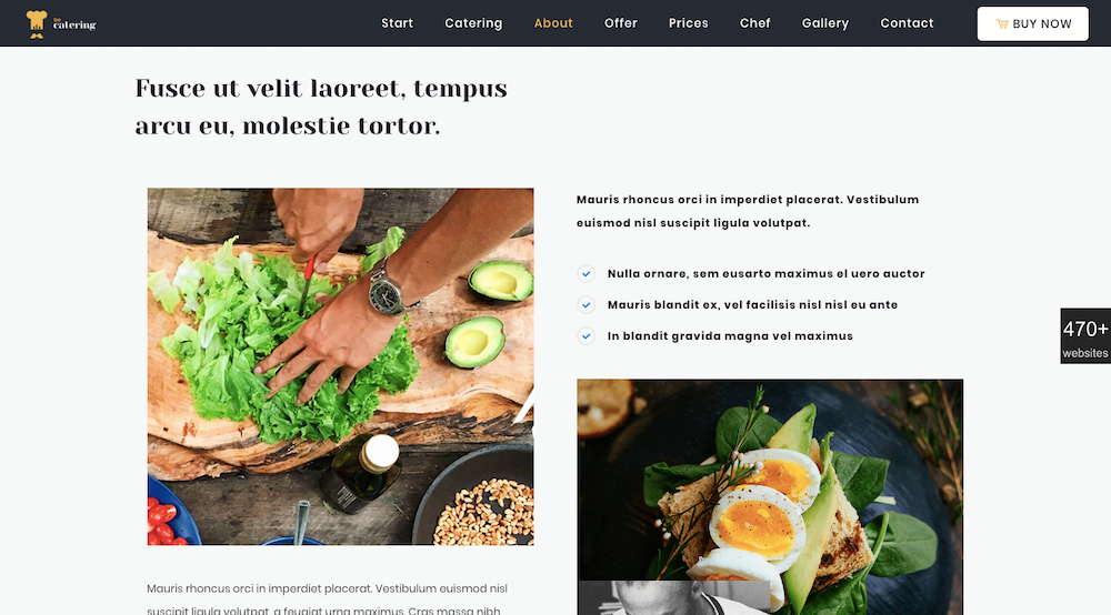
BeCatering also does a great job of adding the human touch to its offering. (It’s something that’s essential to its real world offering but often takes a backseat to the food):
Trend #4: Create a consistent experience with universally-accepted typography
Over the past few years, we’ve seen tons of websites playing around with decorative typography, especially to elicit a sense of nostalgia. The problem with this, however, is that many of these creative fonts don’t translate well across all devices.
You spend so much time creating your web designs, so why would you allow your visitors’ browsers or devices to ultimately pick the backup fonts they’ll see on your sites?
As we move into the ’20s, we’re going to see more websites play it (web-)safe with typography. For starters, it allows for a more consistent experience across all devices. It’s also better for your website’s performance.
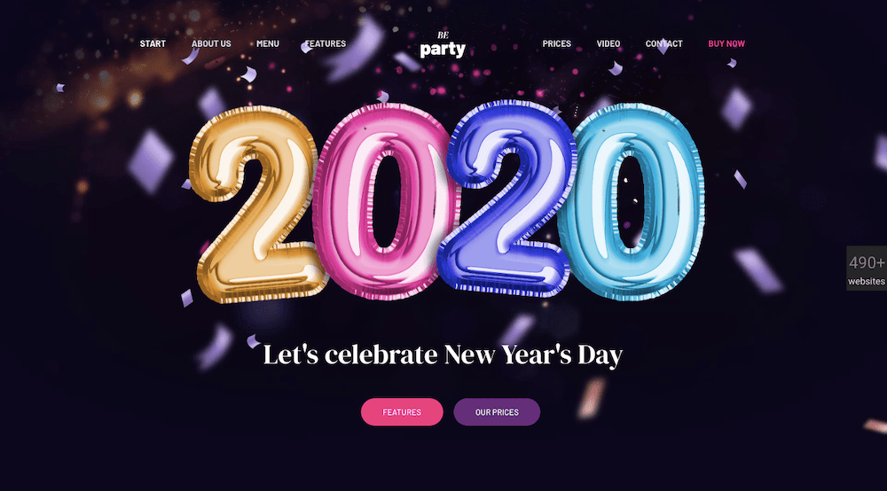
Plus, by using web-safe serif and sans-serif fonts, there are other elements you can invest your creative energies in. Just like this animation on the BeParty site:
Trend #5: Embrace Dark Mode
This is one of the newer web design trends, but it’s already shown a lot of promise in terms of staying power. Just look at your own mobile devices and how many of your apps (or even the device itself) have dark mode options.
Many studies have suggested that dark mode is friendlier on the eyes when viewed in low-light environments and when reading smaller text. Consumers — especially those on mobile — have shown no signs of cutting down on time spent looking at screens. So, it’s no surprise that so many people rave about dark mode.
As such, many web designers are making the move to dark mode-esque color palettes, even if it’s just for key sections of the site.
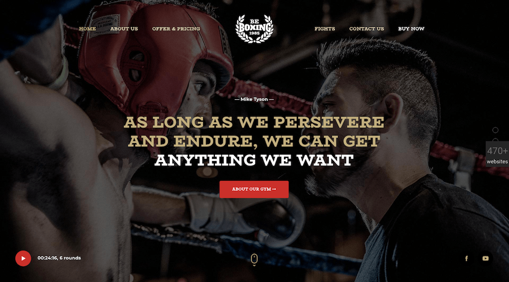
In order to create a more user-friendly web over the long run, websites are likely to go darker in the right contexts as BeBoxing’s concise but powerful hero image does:
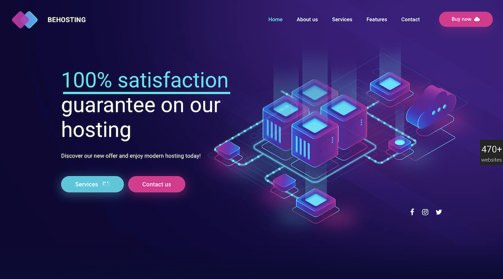
There’s also BeHosting, which uses a more dramatic palette to call attention to its key messages, like this one on the home page:
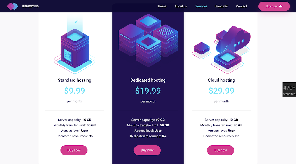
The pricing table has another great example of this as the dramatic, darker palette is used to call attention to the best-value plan without having to explicitly call it out as such:
Original article courtesy of Sitepoint